We are in Part 5 of this tutorial series, that explains how to create a chart in PeopleCode using the Chart API Class. We saw how to create a chart control using Application Designer in Part 1. We also discussed how to write PeopleCode to render a beautiful chart on the page in Part 2. In Part 3 we discussed all the possible chart types in PeopleSoft ranging from 2D to 3D. Examples of all the charts created through PeopleCode were provided in the same part. Part 4 of the series provided some advanced chart options like gridlines and legends. In this post we will discuss how to colour your charts. We will show how to apply beautiful and cool looking colours to your PeopleSoft chart. You can refer to the related post section below if you are keen in previous parts.
You can use the delivered “setcolor” method to create colourful charts through PeopleCode. You will have to pass an array of colour values to this method and this method is invoked using the chart object you saw in Part 2. Here are some colourful charts created through PeopleCode
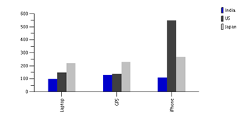 |
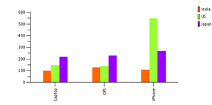 |
 |
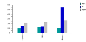 |
| Colour Value | System Variable | Description |
| -1 | %ChartColor_Series_Default | Default Color Series |
| 0 | %ChartColor_Black | Black |
| 1 | %ChartColor_Blue | Blue |
| 2 | %ChartColor_Cyan | Cyan |
| 3 | %ChartColor_DarkGray | DarkGray |
| 4 | %ChartColor_Gray | Gray |
| 5 | %ChartColor_Green | Green |
| 6 | %ChartColor_LightGray | Light Gray |
| 7 | %ChartColor_Magenta | Magenta |
| 8 | %ChartColor_Orange | Orange |
| 9 | %ChartColor_Pink | Pink |
| 10 | %ChartColor_Red | Red |
| 11 | %ChartColor_White | White |
| 12 | %ChartColor_Yellow | Yellow |
| 13 | %ChartColor_Red_Orange | Red Orange |
| 14 | %ChartColor_Yellow_Green | Yellow Green |
| 15 | %ChartColor_Blue_Violet | Blue Violet |
| 16 | %ChartColor_Purple | Purple |
| 17 | %ChartColor_Yellow_Orange | Yellow Orange |
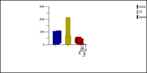
You can also rotate a 3D chart (not a 2D) by setting the rotatingangle property for a chart. I tried rotating a 3D bar chart to 180, 270 and 300 degrees and in each of the cases the output obtained is shown below. Note that you can rotate the chart to any angle between 0 and 360 degrees. Further, specifying this property against a chart of type 2D does not throw any error at runtime. It is simply discarded by PeopleSoft. Examples of rotated charts are provided below
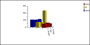 |
| Chart Rotated to 300 degrees |
 |
| 3D Chart Rotated to 270 degrees |
 |
| 3D Chart Rotation angle of 180 degrees |
As you can see above, rotating your chart can make it look ugly. So, choose your rotation angle carefully. More to follow..
No comments:
Post a Comment