In this post, we will discuss some interesting properties and configuration options for creating a colourful and beautiful PeopleSoft Chart / Graph with examples. This is part 4 for creating charts programmatically through PeopleCode. I would recommend the readers to go through the previous parts (refer related posts below) to get an idea of how to get started with the basics of creating a chart in PeopleSoft.
The various properties and configuration options for a PeopleSoft chart object are explained with examples below;
If you want to show horizontal grid lines for your PeopleCode chart, use the Gridlines property and set it to %ChartGrid_Horizontal. An example chart with horizontal gridlines set is shown below (for the same test case we used in earlier parts)  | We saw how to create a PeopleSoft chart with horizontal gridlines enabled earlier. To create a chart with vertical gridlines alone use the Gridlines property and set it to %ChartGrid_Vertical. Refer to the chart created below for an example;  |
A chart with both horizontal and vertical gridlines enabled is shown below. This chart is obtained by setting the Gridlines property to %ChartGrid_Both.  Note that the default property for chart is not to display any gridlines. This can also be forced through the property %ChartGrid_None which is the default for a chart object. | It is possible to specify a pattern or style for the gridlines using Gridline Style property for a chart object. An example of a chart with Dotted gridlines is shown below. This is enforced by using the property %ChartLine_Dot. Refer to a chart sample below; 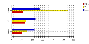 This property is applicable only if Gridline property is set. This property is applicable only if Gridline property is set. |
An example for a graph with dashed gridlines is shown below.The dashed gridlines is obtained by setting the style to %ChartLine_Dash. 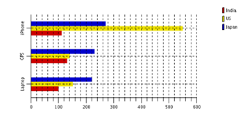 | It is also possible to get a combination of both dotted and dashed gridlines for a PeopleCode chart. This is realized by using the style %ChartLine_DashedDot. Refer to an example graph below  |
An often searched and sought feature with PeopleSoft charts is positioning of legend information. It is possible to create a chart with Legends positioned on top, left, right, bottom and separate. Here is an example where legend is placed at the top (use Legend Position property for this set to %ChartLegend_Top. 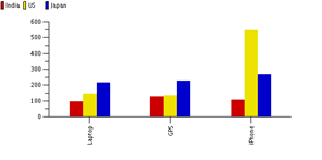 | If you want to place the legend information for a chart at the bottom of the chart, then you can use the property value as %ChartLegend_Bottom. An example of a chart with legend set to bottom is shown below  |
You can also set the Legend information to the left of the chart. To do this, you need to set the property value to %ChartLegend_Left. For placing it right, you have to use %ChartLegend_Right. We have already seen charts with Legend placed to right. An example, where it is placed to the left is shown below 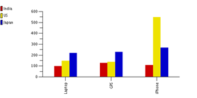 | There is also a property %ChartLegend_Separate which will completely hide the graph and show only the legend information. An example for this usage and sample chart is shown below 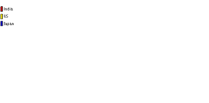 |
In our next post, we will discuss rotating 3D charts in PeopleSoft. We will also discuss how to change chart colors with suitable examples. And the bigger chunk, integrating PeopleSoft with Javascript API for creating charts will also be covered in subsequent parts. Follow us on Facebook and Twitter so that you don’t miss an update..
thanks a lot
ReplyDeletethanks a lot
ReplyDelete