XYDataset Line Chart
In this post, we will discuss how to create a XY line graph in JFreeChart by using XYDataset interface in Java. This is different to our previous tutorial, that dealt with pure line chart creation in Java. We will implement three series of line charts in the XY line chart, and also discuss methods to adjust the range of charts to make our charts more meaningful in display. To start with, make sure you download the complete JFreechart library and have all the JAR files in your classpath. Let us get started with the example now.
Java Program – XYDataset – XYLineChart – JFreeChart
The Java Program to create a XYLineChart using XYDataset is shown below. We will walk through the steps so that you can understand it better.
/* The java code below generates a XY line chart using JFreeChart java API */
import java.io.*;
import org.jfree.data.xy.XYSeries;
import org.jfree.data.xy.XYSeriesCollection;
import org.jfree.chart.plot.XYPlot;
import org.jfree.chart.axis.*;
import org.jfree.chart.ChartFactory;
import org.jfree.chart.plot.PlotOrientation;
import org.jfree.chart.JFreeChart;
import org.jfree.chart.ChartUtilities;
public class XYlineChart {
      public static void main(String[] args){
         try {
                /* Define some XY Data series for the chart */
                XYSeries team1_xy_data = new XYSeries("Team 1");
                team1_xy_data.add(1990, 45);
                team1_xy_data.add(1991, 16);
                team1_xy_data.add(1992, 80);
                team1_xy_data.add(1993, 1);
                team1_xy_data.add(1994, 6);

                XYSeries team2_xy_data = new XYSeries("Team 2");
                team2_xy_data.add(1990, 2);
                team2_xy_data.add(1991, 10);
                team2_xy_data.add(1992, 60);
                team2_xy_data.add(1993, 60);
                team2_xy_data.add(1994, 18);

                XYSeries team3_xy_data = new XYSeries("Team 3");
                team3_xy_data.add(1990, 15);
                team3_xy_data.add(1991, 5);
                team3_xy_data.add(1992, 14);
                team3_xy_data.add(1993, 18);
                team3_xy_data.add(1994, 25);

                /* Add all XYSeries to XYSeriesCollection */
                //XYSeriesCollection implements XYDataset
                XYSeriesCollection my_data_series= new XYSeriesCollection();
                // add series using addSeries method
                my_data_series.addSeries(team1_xy_data);
                my_data_series.addSeries(team2_xy_data);
                my_data_series.addSeries(team3_xy_data);


                //Use createXYLineChart to create the chart
                JFreeChart XYLineChart=ChartFactory.createXYLineChart("Team - Number of Wins","Year","Win Count",my_data_series,PlotOrientation.VERTICAL,true,true,false);

                /* Step -3 : Write line chart to a file */
                 int width=640; /* Width of the image */
                 int height=480; /* Height of the image */
                 File XYlineChart=new File("xy_line_Chart_example.png");
                 ChartUtilities.saveChartAsPNG(XYlineChart,XYLineChart,width,height);
         }
         catch (Exception i)
         {
             System.out.println(i);
         }
     }
 }
A XY line chart can have one or more series. We define each of the series using XYSeries class, and add each of the XY points using the "add" method. As you see, we have three teams ,and we are adding the number of victories each team has got between the years 1990 to 1994 as three set of series.
You cannot pass a series directly to create the chart. You need to add all the series to a collection, and we have XYSeriesCollection here to help. We use the collection and add all the data into the series. This is done by using "addSeries" method available in XYSeriesCollection class.
Finally, we create the chart object using "createXYLineChart" method and pass the collection we created earlier to it. The chart is saved as a PNG image, and the output of the program is shown below:
 |
| JFreeChart - XYDataset - XY Line Chart / Graph Example - Output |
Control Chart Range / Increment Value in Plot
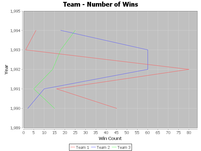
Now, if you look at the chart above, the range has values like 1990.5 etc. You may not like to see such values, and look for approaches to control the range of values on the plot area.You can do this by controlling the values you want to show in the domain axis, and clearly defining the gap between the values in the chart. For this, you need to get into the Plot and then use methods like setRange and setTickUnit to define the gap. A code snippet to do this is shown below:
                /* Control Number Range for X Axis */
                XYPlot xyPlot = XYLineChart.getXYPlot();
                NumberAxis domainAxis = (NumberAxis) xyPlot.getDomainAxis();
                domainAxis.setRange(1989, 1995);
                domainAxis.setTickUnit(new NumberTickUnit(1));
Here, we get the chart plot into XYPlot object. And then use getDomainAxis method to get the chart Axis. From there, we are able to define the chart range and the increment value. The output of the new modified chart is shown below:
 |
| XY Line Chart - Customize Chart Range / Increment Value - Java Example |
Do you see a "," after the first digit in the year? Do you know how to remove this? If so, post it in the comments section.
We will cover all the plot configuration options in JFreeChart in a separate tutorial. For now, this should satisfy us. Also, you can set the plot orientation to Horizontal. This will produce a different chart in the output, aligned horizontally. A code snippet change to get this done and the corresponding chart output is shown below:
                //Use createXYLineChart to create the chart
                // Plot orientation is set to horizontal here
                JFreeChart XYLineChart=ChartFactory.createXYLineChart("Team - Number of Wins","Year","Win Count",my_data_series,PlotOrientation.HORIZONTAL,true,true,false);
The output in this case is provided below:
 |
| XY Line Graph - Plot Orientation set to Horizontal - JFreeChart - Java Example |
org.jfree.data.xy.XYSeriesCollection cannot be cast to org.jfree.data.XYDataset
ReplyDeletecan we flush data after some point? I mean I needed to show constant amount of data window
ReplyDelete